My Work
A collection of projects showcasing my creative direction, branding, and digital expertise, from music labels to modern brands.
Visual Identities
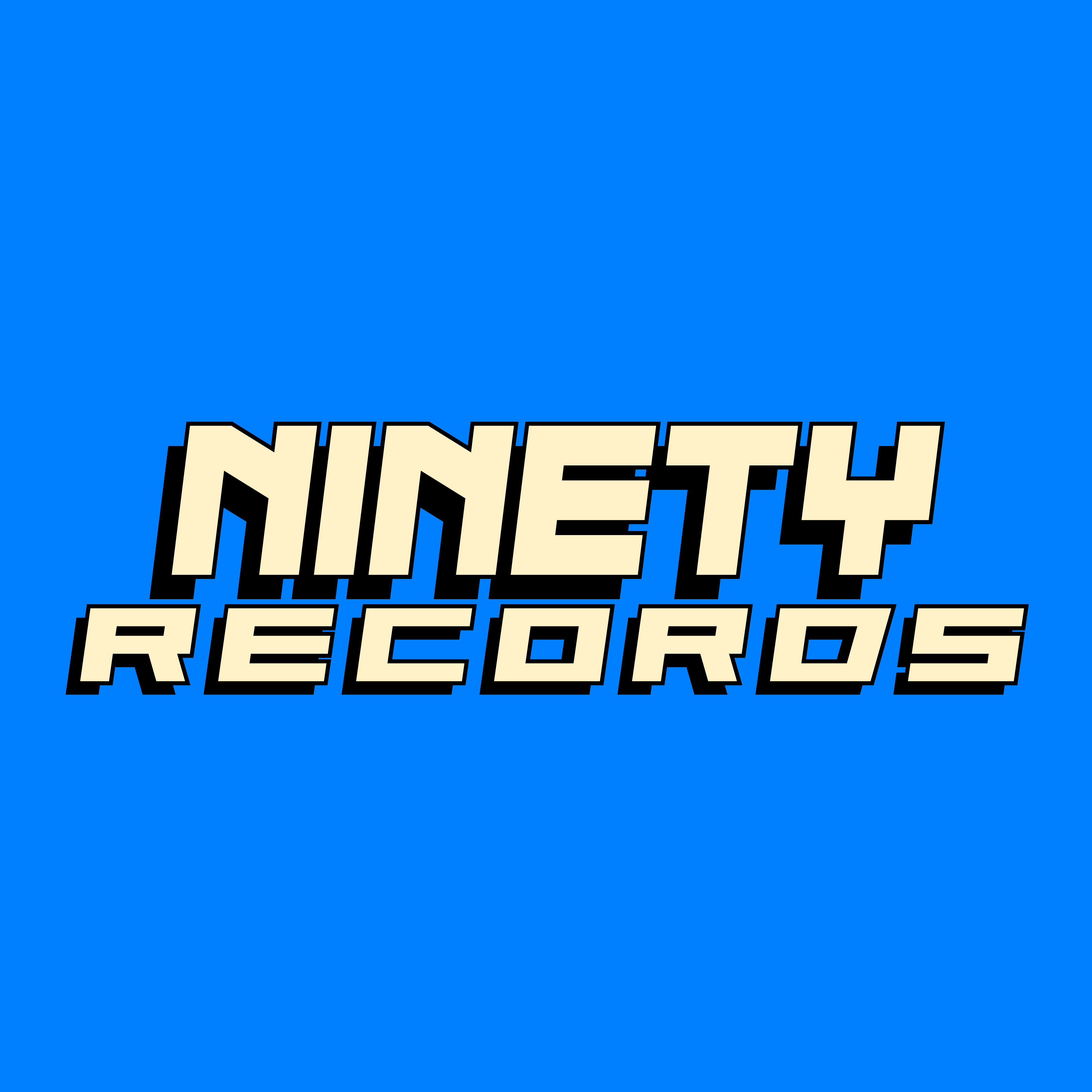
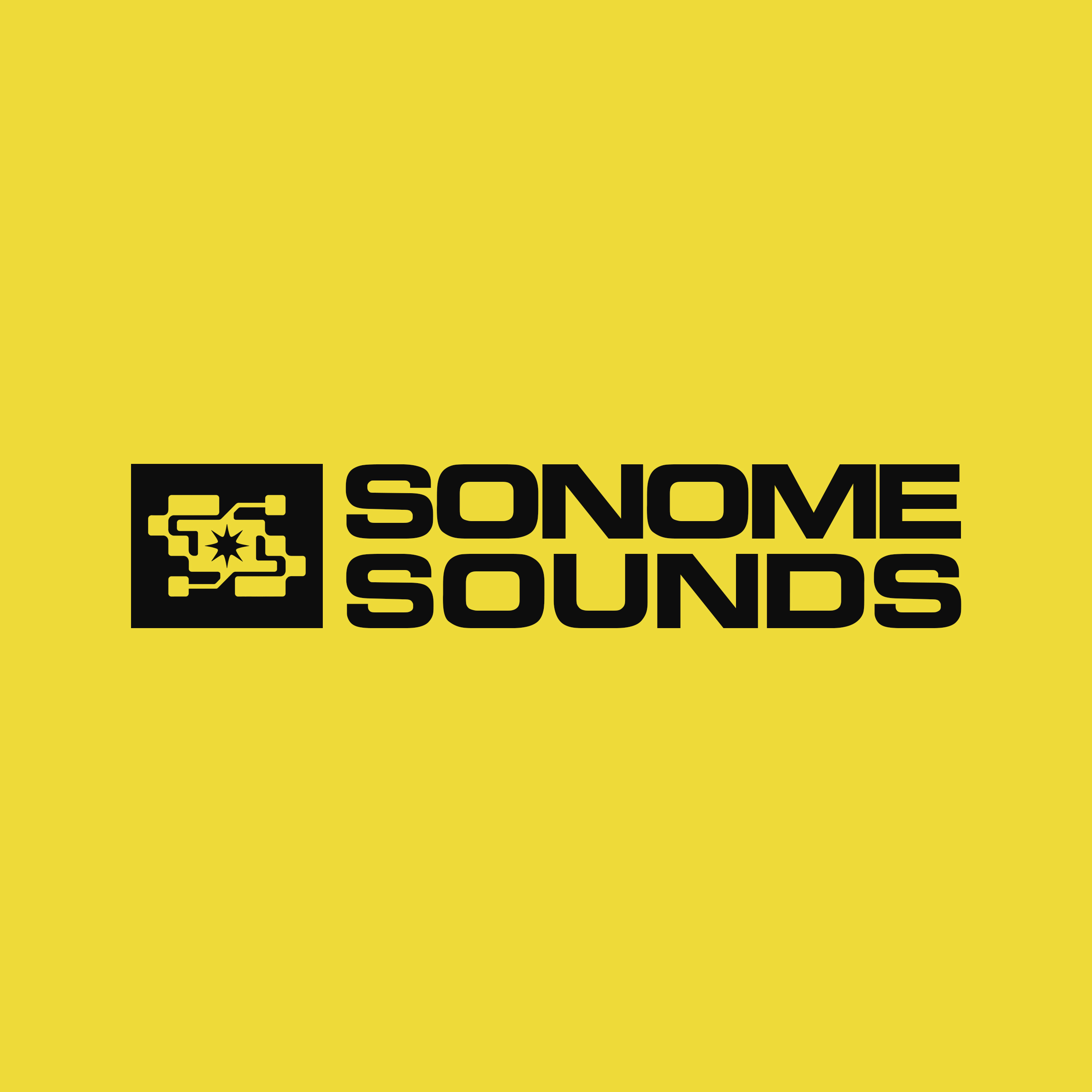
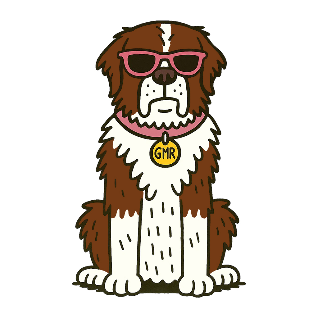
Brand identities I've designed across music, tech, medical, and management industries. Click to learn more.
Web Design
Websites I've designed and developed for clients across different industries.
Sonome Sounds
Audio Software Website
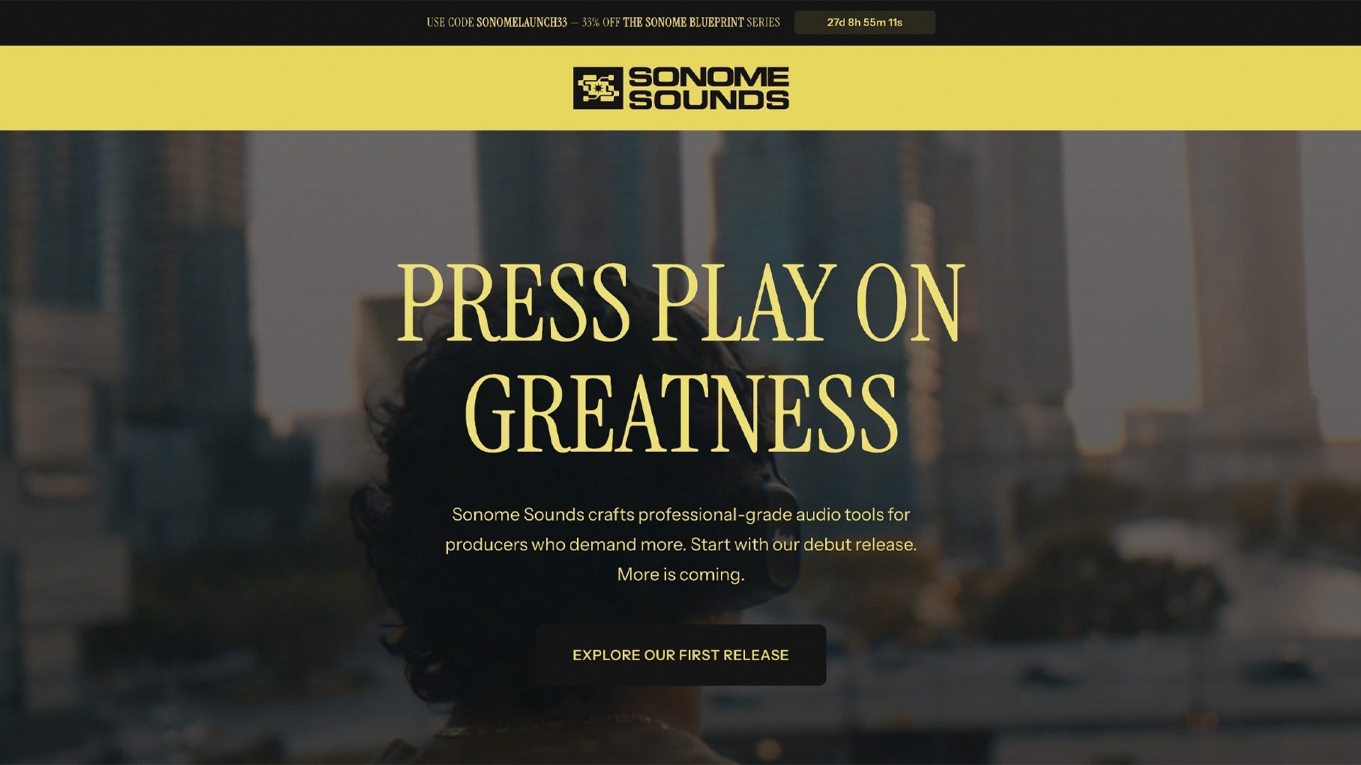
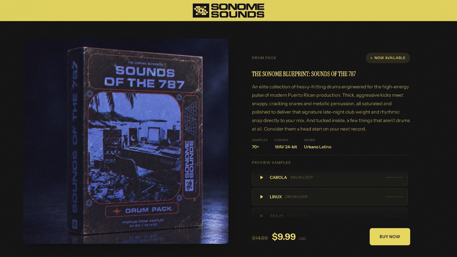
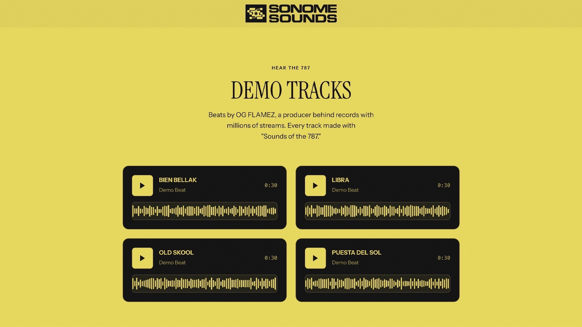
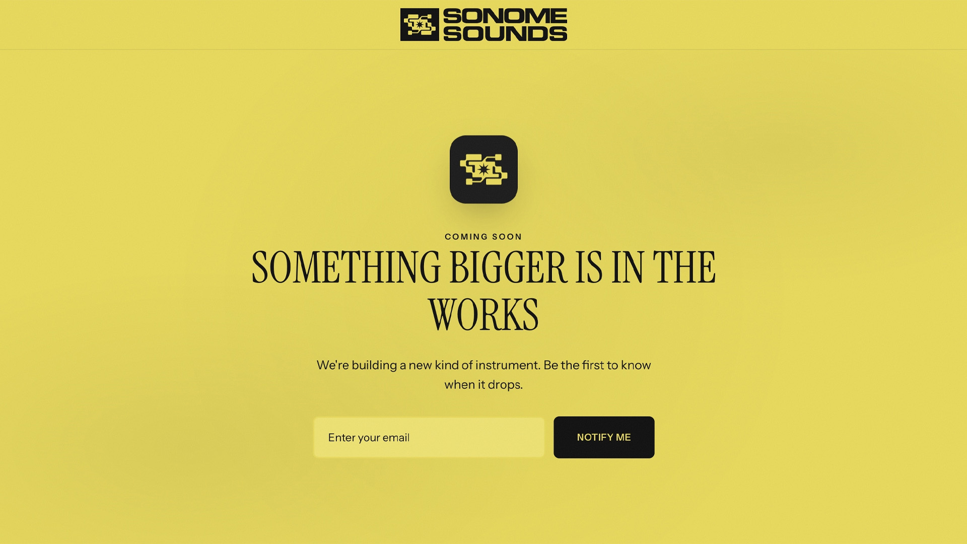
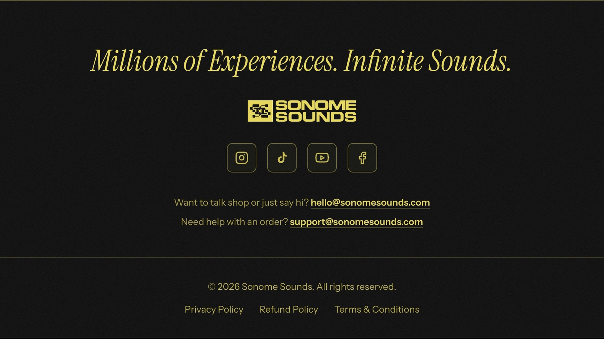
I designed and built the Sonome Sounds site to carry the brand identity straight through to the web, then push it further. It keeps the same retro, early-hardware feel and expands on it with typography and visuals borrowed from vintage magazines, giving the site an editorial quality. The direction was deliberately elevated, closer to a luxury fashion label than a typical software site, so the product reads as premium and the experience stays true to the visual identity I set from the start.
Role
Web Designer & Developer
Year
2026
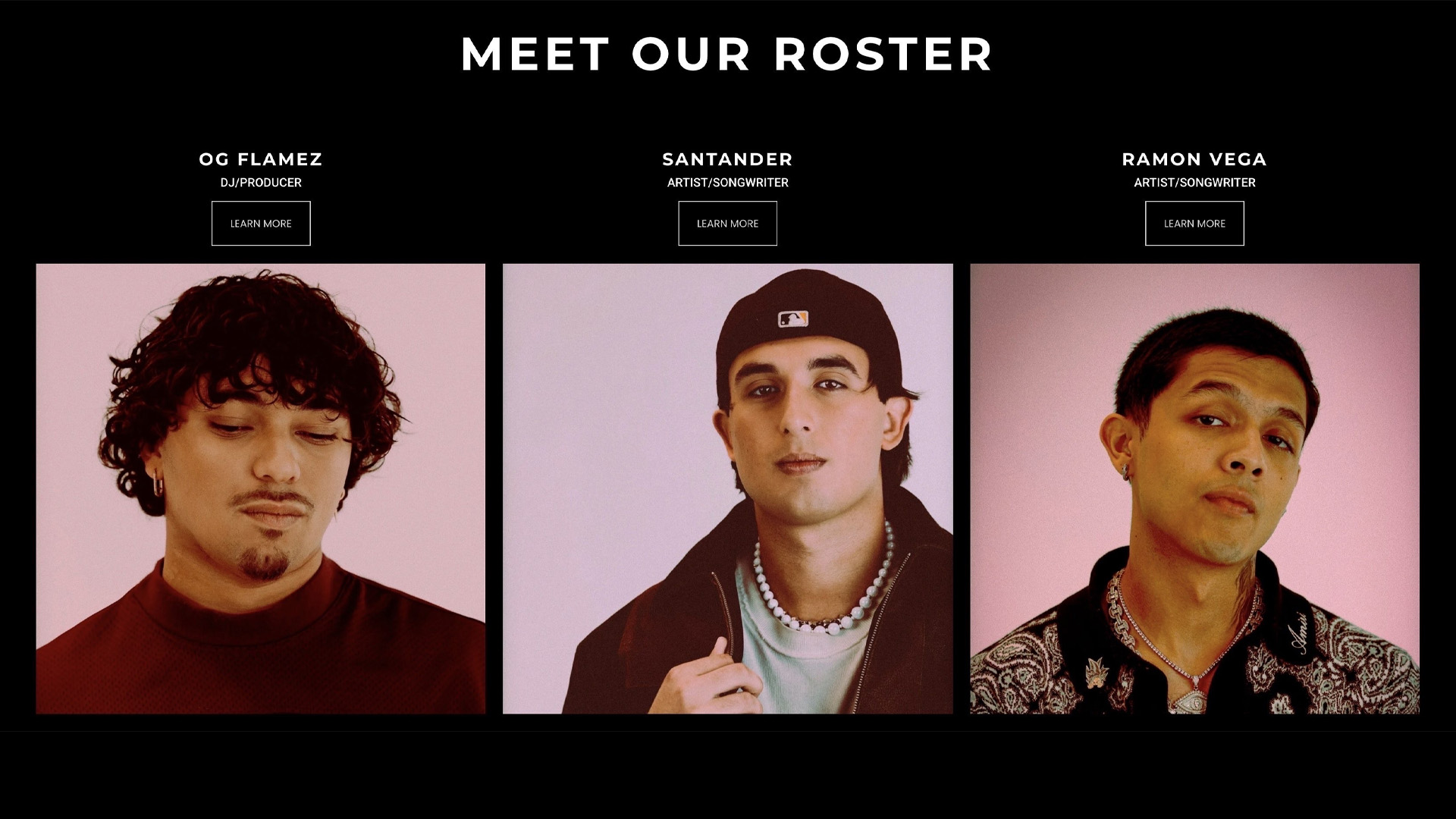
Groovy Management Republic
Music Management Website
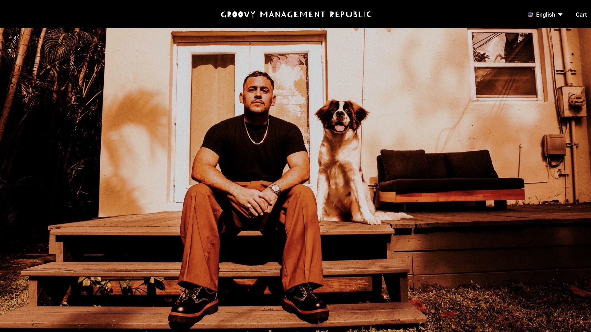
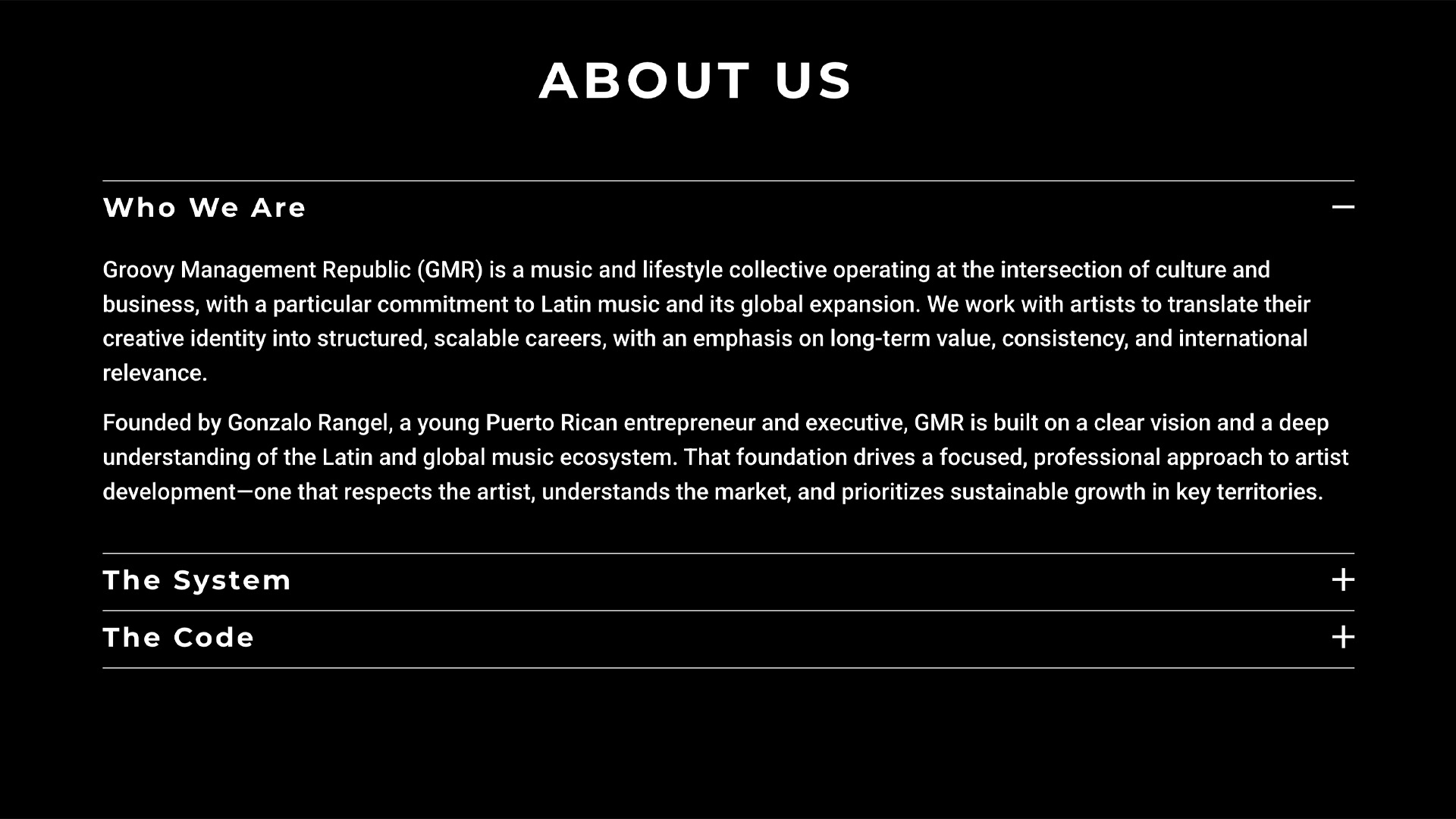
The Groovy Management Republic site is a grounded introduction to the collective, built around its values, its mission, and the roster of artists it supports. I kept the design deliberately straightforward and let the brand's personality carry the character, so the focus stays on the substance: who the team is and who they represent. It gives collaborators and prospective clients a clear, genuine sense of the people behind the music.
Role
Web Designer & Developer
Year
2025

Content Creation
Short-form video content I've shot, edited, and produced from start to finish.
Sonome Sounds Launch Video
Video Production
A short-form launch video for Sonome Sounds, built around the company's motto, "Millions of Experiences. Infinite Sounds." Through rapid cuts and sounds captured across different locations, the piece turns that motto into something you can see and hear, pulling the brand's whole identity together in motion. I drew on the bold, high-energy style of early-2000s ads and handled the production end to end: I shot the original footage, color graded, edited the visuals, and selected the music to create a cohesive piece that captures the brand's energy and technical identity.
Role
Videographer, Editor, Colorist: Footage, Color Grading, Editing, Music Selection
Year
2026
Product Design
Cover art and packaging design for digital products, carrying brand identity into commercial deliverables.
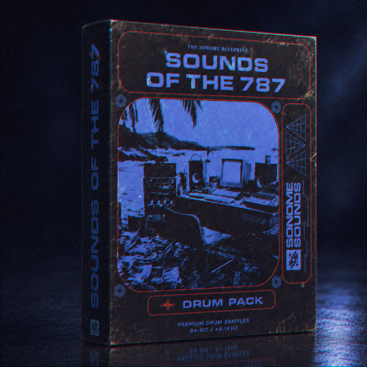
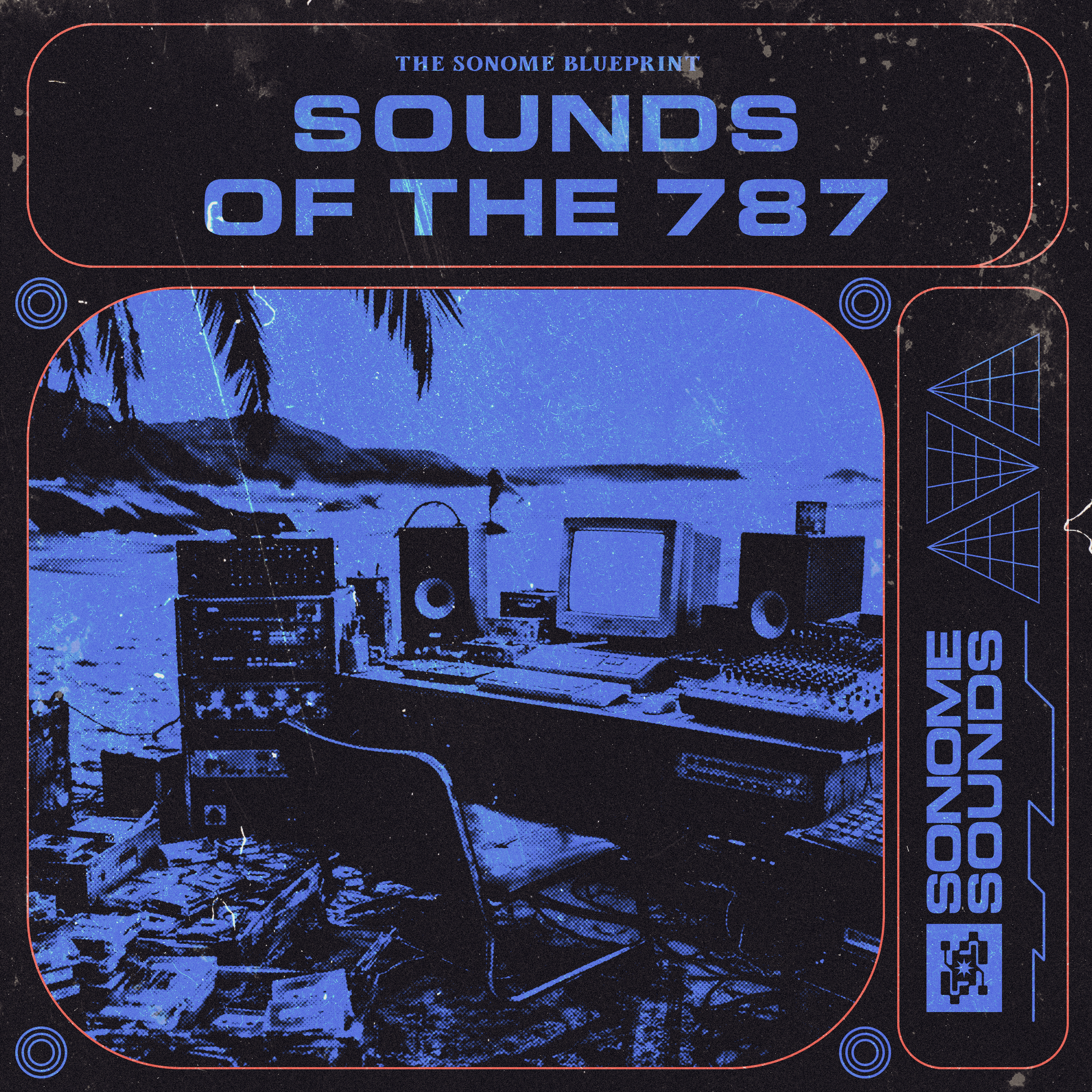
Sounds of the 787
Drum Pack Cover Art
Cover art and packaging design for Sounds of the 787, a drum pack from Sonome Sounds. The artwork is built around one scene: a recording studio set up on the beach, a nod to Puerto Rico (787 is the island's area code) and to the producers there who turn that setting into sound. I finished it with a gritty, 90s-inspired treatment of color grading, grain, and chromatic aberration over retro typography and spec detailing, so the cover feels as much like a piece of vintage gear as a modern release.
Role
Designer: Cover Art, Packaging Design
Year
2026
Email Marketing
Custom-coded email templates designed for conversion, brand consistency, and inbox readability.
Sonome Sounds Welcome Email
Onboarding Email Template
A welcome email sent to new subscribers as Sonome Sounds launched. The design carries the brand's yellow-and-black palette directly into the inbox and leads with value: a warm welcome, the first two drum packs with a launch discount, and a clear sense of what subscribers get for being on the list. Hand-coded in HTML with full Outlook and mobile compatibility.
Role
Email Designer & Developer: HTML/CSS, Copy, Brand Application
Year
2026
More to Come
I'm always working on something new. Feel free to connect or reach out.